Watercolour and Gouache: Two Ways to Build a Painted Surface
Watercolour and gouache suit different ways of building a painted surface: choose the one that matches your preferred layering, revisions and finish.
Watercolour and gouache build a painted surface in different ways: watercolour lets light return through thin washes, while gouache can cover what lies beneath. If you are choosing between them, start with the surface you want to see and the kind of revision you expect to make. Neither medium is the sensible option in every situation; paint is not a moral test.
How layers behave
Transparent watercolour is usually applied in diluted washes. On white paper, light travels through the pigment and reflects from the sheet, then passes back through the colour. A pale area can therefore come from leaving paper untouched, laying down a light wash, or combining the two. The paper is part of the image, not merely a support waiting to be hidden.
Each dried wash changes the colour beneath it without usually concealing it. A yellow glaze over blue, for instance, may produce a different impression from either colour alone. The result depends on pigment and handling, so small trials on the same paper can help you judge a mixture before committing to a larger passage.
Gouache uses more opaque pigment and typically a higher proportion of pigment to water. It can sit over earlier marks and cover them, particularly when applied in a substantial layer. That gives the painter another way to describe light: pale paint can be placed on top of a darker passage rather than reserved as bare paper.
Opacity is not a promise of perfect coverage. A watery application may remain translucent, and a dark or strongly coloured layer may influence what is placed over it. Gouache also changes appearance as it dries, so a wet patch is an unreliable guide to the final surface. Both media reward a pause and a comparison with a dry passage.
Choose by working habit
Do you want light to come through the paper?
Choose watercolour if you want translucent colour, open whites and layers that retain glimpses of earlier washes. It suits a process in which the paper supplies the brightest notes and the painter plans around them. A lost pale area can be awkward to restore, but that constraint can also make decisions clearer.
Do you expect to revise shapes?
Choose gouache if you want to adjust a silhouette, cover a colour that has wandered, or place a light shape over a dark one. Its opacity makes those revisions more direct. A fresh layer may still disturb or show through an older one, so revision is easier than with transparent washes, not magical.
Do you prefer a quiet surface or a solid one?
Watercolour often leaves a surface in which paper texture and overlapping washes remain visible. Gouache can make a more even, matte field, though brush marks and changes in dilution may remain apparent. If you want both effects, they can be combined, but practise the order and compatibility with the particular paints you have.
Do you want the paint to move freely?
Both media use water, but watercolour is often allowed to spread and mingle as a deliberate part of the image. Gouache is commonly handled in more controlled, shaped applications, especially when covering an area. Either can be loose or precise; the difference is less a rule than a useful starting expectation.
When watercolour fits
Watercolour fits subjects where transparent passages contribute to the feeling of light or atmosphere. It is a natural choice for a pale sky, a wash of colour over a drawing, or a sequence of thin layers in which one hue should remain visible beneath another. It also suits painters who enjoy deciding in advance where the paper must stay bright.
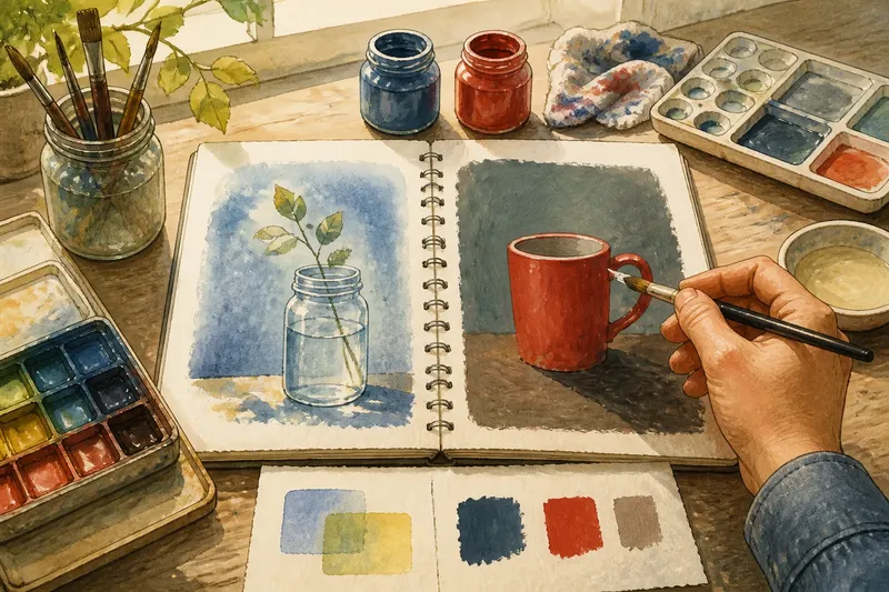
Say you want to paint a glass jar against a soft blue background, with the white paper carrying the brightest reflections. You could preserve those small highlights, add a light blue wash around them, then deepen the background with another transparent layer after the first dries. The expected result is a luminous field with the paper showing through, though each added wash may shift the colour and should be judged on the page.
Watercolour is less convenient when the plan depends on repeatedly painting pale shapes over dark ones. You can lift or lighten some marks, depending on the pigment, paper and timing, but lifting may leave a visible change in the sheet. Treat it as a possible adjustment, not an undo button.
When gouache fits
Gouache fits paintings built from distinct shapes, muted blocks of colour or light marks laid over darker passages. It is useful when the image needs a clear silhouette that can be altered, or when the surface should read as an arrangement of opaque painted areas rather than as coloured light through paper.
Imagine you begin a simple painting of a red mug on a dark table and later decide its handle is too narrow. With gouache, you can repaint part of the surrounding area and redraw the handle in a broader shape once that layer is dry. The expected result is a revised silhouette that sits over the earlier version, although a thick patch or mismatched colour may still reveal the change.
Gouache asks for attention to consistency. Too much water can make a coat less opaque, while a very dry brush can leave broken marks. Mixing enough paint for a shape, using a test scrap and letting a passage dry before covering it are modest ways to reduce avoidable surprises. The finished work can also be sensitive to rubbing or moisture, so choose a suitable surface and follow the paint maker’s guidance for handling and display.
Paper and palette choices
Paper affects both media. Watercolour paper is made to take repeated wet applications more comfortably than many ordinary drawing papers. Gouache can be used on watercolour paper too, and its opacity may make some surface irregularities less prominent, but the sheet still affects how the brush moves and how quickly the paint dries. A small sample on the intended paper is more informative than a confident guess at the art shop.
Watercolour palettes often invite gradual mixing: a small amount of pigment spreads through water, and a pale wash can be adjusted by adding more paint. Gouache mixtures are usually mixed to a body that covers, then thinned as needed. Keep a scrap beside the palette. It lets you check whether a mixture is transparent, opaque, too wet or simply a different colour once dry.
Tube paints are available in both media, and watercolour also comes in pans. Gouache tends to be easier to mix in small working batches when the task requires broad, even blocks; watercolour pans can be convenient for compact, diluted washes. These are practical tendencies rather than strict divisions. The consistency you make with water matters as much as the label on the tube.
Mixing the two
Watercolour and gouache can share a painting when each is given a job. Transparent washes can establish a coloured ground, with gouache adding opaque accents, pale details or a revised shape. This approach gives a painter both kinds of surface without asking either medium to behave like the other.
The order matters. A gouache layer may reactivate or shift if worked over with a wet brush, and a watery wash brushed across an opaque passage can disturb it. Letting layers dry and testing the sequence on spare paper can help you see how the specific paints behave. If you want an image to remain mostly transparent, use gouache sparingly; if you want solid blocks, do not expect a few transparent washes to supply the same coverage.
For a first comparison, paint two small versions of the same subject on the same paper. In one, reserve white areas and build colour with transparent washes. In the other, cover the ground with gouache and place lighter shapes over it. The subject stays constant, so the differences in layering, revision and finish become easier to notice.
Make the choice
Choose watercolour when the paper should contribute light, layers should remain visible, and you are content to plan around areas that are hard to restore. Choose gouache when you want to cover, reshape and place opaque marks over earlier colour. If your aim includes both effects, combine them deliberately and check the sequence on your materials.
The useful question is not which paint is better, but which surface your next decision needs. A transparent wash and an opaque correction offer different kinds of freedom. Keep a test scrap near the work, and let the marks you want to make settle the choice.